Blog / Systems
Systems · Buyer guide
How to Make Stainless-Steel Kitchen Cabinets Look Warm, Not Industrial
The short answer
Stainless-steel kitchen cabinets look warm when they are treated as one material in a complete residential palette—not as an all-metal room. Pair controlled stainless surfaces with timber, textured stone, warm light and quiet hardware, then coordinate proportions, grain direction and appliance finishes before production.
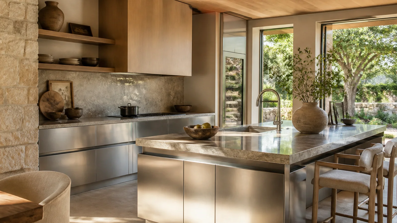
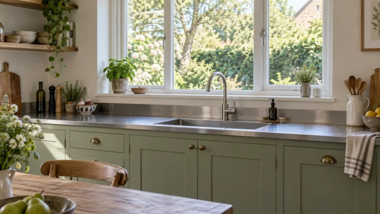
The “industrial” problem usually comes from composition, not from stainless steel itself. A room starts to feel commercial when every plane is reflective metal, the lighting is cool and flat, the proportions are equipment-like, and the visual details are chosen independently. Residential warmth comes from hierarchy: stainless steel does the precise work while other materials carry texture, softness and familiarity.
Start with the surface, not the cabinet colour
“Stainless steel” is not a complete visual specification. Directional brushed, bead-blasted, embossed, coloured and coated surfaces can look very different. Even two brushed samples may read differently under the same light because of grain, roughness and reflectivity.
Select the actual finish sample early and review it vertically and horizontally. A screen image cannot reproduce reflectivity or grazing light. Also confirm which faces are metal: doors only, doors and end panels, a complete island skin, or the entire kitchen. The amount and location of stainless steel matters more than the label.
Use stainless steel as the precise layer
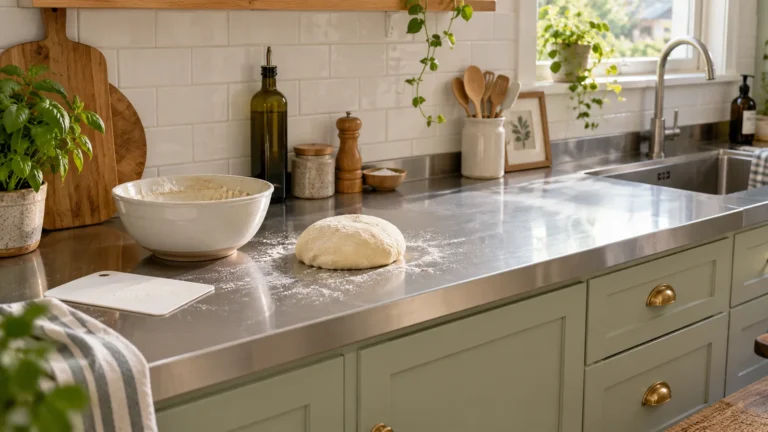
A warm scheme often gives stainless steel a clear role rather than letting it dominate every surface. It can frame the cooking zone, form the sink run, protect a frequently cleaned island, or create a thin architectural band. Timber, stone, plaster, glass or textured wall finishes can then carry the softer visual weight.
| Material | What it contributes | Coordination risk |
|---|---|---|
| Natural or wood-look panels | Warm colour, grain and domestic familiarity | Undertone can conflict with stone or lighting |
| Honed or textured stone | Mass, depth and a low-glare surface | Edge thickness and joint location must align with cabinetry |
| Warm plaster or paint | Soft background that reduces metallic contrast | Colour can shift under different light sources |
| Dark hardware or frames | Graphic definition and visual continuity | Too many unrelated black finishes create noise |
Control the material ratio
There is no universal percentage that makes a room feel residential. The correct ratio depends on room size, daylight, ceiling height and where the viewer first enters. Use elevations and perspective views to identify the dominant field in each view. If the first view is an uninterrupted wall of metal, a warm worktop alone may not change the impression.
Practical moves include using timber for tall-unit doors, limiting exposed metal to base units, wrapping an island in stone, or reserving stainless steel for the sink and cooking zones. The goal is not to hide the material; it is to give it contrast.
Choose lighting that reveals texture without creating glare
Stainless steel reflects the light and colours around it. Cool, high-output lighting across large metal planes can create a clinical appearance. Warmer ambient light, controlled task light and a layered lighting plan generally produce a calmer residential reading.
Do not choose colour temperature in isolation. Mock up the stainless, timber, stone and paint samples under the proposed lighting. Check both daytime and nighttime conditions. Also review under-cabinet strip placement: an exposed line of LEDs reflected in a metal backsplash or work surface can be distracting.
Make the cabinet proportions residential
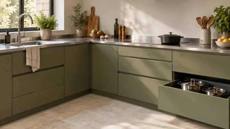
Commercial equipment often communicates through exposed legs, large handles, visible fasteners and repetitive modules. A villa kitchen can use stainless steel with quieter architecture: integrated plinths, aligned door widths, concealed fixings, controlled shadow gaps and a consistent handle strategy.
- Align drawer divisions with appliance and worktop geometry.
- Use end panels and fillers to finish elevations cleanly at walls and tall units.
- Coordinate handle lengths and positions across metal and timber fronts.
- Decide whether appliances should blend with the stainless field or read as separate dark volumes.
- Review every exposed side, not only the front elevation.
Coordinate appliances before finalizing the look
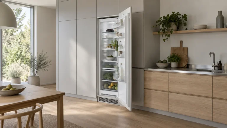
Appliances are large visual objects. Their glass colour, stainless tone, handle shape and installation depth can either support or fragment the scheme. Obtain exact model numbers before final approval and draw them into the elevations. “Standard oven” or “900 mm refrigerator” is not enough for a coordinated custom kitchen.
For a complete pre-review package, use the guide on what to prepare before a custom kitchen project review. It covers room information, appliance data and scope inputs that affect both appearance and fit.
Build a physical sample board
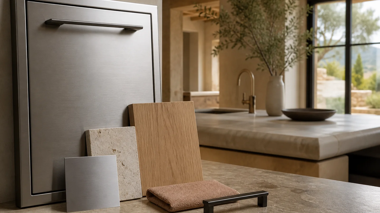
A useful sample board contains the proposed stainless finish, worktop, timber or alternative front, wall finish, hardware finish and—where possible—an appliance finish reference. Label each sample with the exact supplier code. Photographing the board is useful for records, but the physical board remains the decision tool.
Review the board in three conditions: diffuse daylight, planned ambient light and task light. Move the stainless sample through the intended vertical and horizontal orientations because grain direction changes the reflection.
Freeze the palette at elevation level
A mood board is not a production instruction. Before fabrication, convert the palette into elevations that state where each finish starts and stops, which edges are exposed, how grain runs and what happens at corners, fillers, appliance interfaces and worktop overhangs. This is also the point to approve a representative door or corner sample if the visual risk is high.
Residential warmth checklist
- Exact stainless finish and grain direction approved on a physical sample.
- Material ratio reviewed from each principal room view.
- Timber, stone, paint and hardware undertones coordinated together.
- Day and night lighting reviewed for glare and reflected LED lines.
- Appliance models drawn at their actual visible dimensions.
- Plinth, fillers, end panels, handles and shadow gaps resolved.
- Finish transitions documented in elevations, not left to verbal interpretation.
Bottom line
A stainless-steel kitchen feels residential when precision is balanced with tactile materials, calm proportions and warm light. Do not solve the problem by adding decorative elements late. Resolve the complete palette and the full elevations before production so the room reads as one design rather than a collection of metal cabinets.
Review the project before production
Send your floor plan, destination country and project quantity for a preliminary specification review.